This is part 4 in a series on the redesign of fetchsoftworks.com; the series starts at Part 1: My Original Sin.
Design Space
Joe had ideas, lots of ideas, and quickly presented us with twenty (!). I thought they were all amazing in one way or another, and most of them were virtually ready to use. But we had to choose just one, to represent who we are. At this point, the task of redesigning an ugly website, which turned into the task of choosing a new company logo, seemed to turn into something more basic. We were asking ourselves the big questions: Who are we? What makes us who we are? Who do we want to be? We fumbled for labels and adjectives.
Two of the adjectives we settled on were “simple” and “clean”; they are two qualities we strive to achieve with our software, and important qualities for a good logo. “Memorable” was another; Fetch’s running dog cursor is not just there to entertain the user, it also makes the experience of using Fetch a little different, and a bit easier to remember. (We also “self-identified,” in therapy parlance, as “picky.”; more about that later.) And we recognized the importance of another label: we are the-company-that-makes-Fetch. Our choice of logo had to deal with the fact that people know us as the company that makes that program named for a game dogs play, and that has a dog icon, and plenty of doggy imagery and wordplay in its advertising, tradeshow giveaways and t-shirts.
Goldilocks and the Three Logos

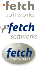
With those criteria in mind we narrowed Joe’s menagerie of logo ideas to three: the dot, the jumping dog, and the dogtag. The dot was my initial favorite: its simplicity and cleverness was the sort of thing that had attracted us to Joe’s designs in the first place. The floating bright orange dot was as primitive and simple as shapes get, while challenging the viewer to see it as a thrown ball being chased by a tail-wagging pooch.

But I feared that the dot was too subtle — how many people would ever make the dot→ball→dog connection? I think it’s neat that the Amazon logo has an arrow from the A to the Z (they sell everything from A to Z, get it?), but I've yet to run into anyone else who even noticed. There is such a thing as being too cryptic. The FedEx logo works whether or not you know the secret, but I worried that the dot would not strike many people as meaning “Fetch Softworks.”
The dog, on the other hand, was too blunt. It tied us too closely to dog imagery. If we decided that the world really needed another Twitter client, we’d have to call it something like Birddog. I feared a future where we had a litter’s worth of different dog logos, none of them strong, representing different dog products.

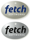
The dog tag was just right. The basic oval shape was simple and clear, and recognizable even shrunken down to favicon size ![]() . The design worked in monochrome as well as color. It connected with our existing canine identity, but in an understated way, and without competing with our existing dog logo. The company name, in handcrafted type, left no doubt as to what company was being represented. It worked whether you realized it was a metal dog tag or not.
. The design worked in monochrome as well as color. It connected with our existing canine identity, but in an understated way, and without competing with our existing dog logo. The company name, in handcrafted type, left no doubt as to what company was being represented. It worked whether you realized it was a metal dog tag or not.
Now we had a company logo, and could return to our original goal: redesigning the website.
Logo sketches are Copyright © 2007 Joe Finocharrio Design.


What did you pay Joe (who designs for Cisco) for this logo design?
I won’t divulge what we paid Joe, except to say that I think we got our money’s worth. If you need a logo design I’d definitely recommend contacting him.
How ’bout you guys stop redesigning your logo and update your app? Wouldn’t that be a wiser investment?? After all, it only looks like it was ported from Mac OS 9 some 11 years ago.
We finished the logo redesign described in this blog post more than two years ago, and since then we’ve released two major Fetch updates, and our first iPad app, Roadshow.
I completely agree, however, that we’re overdue for a Fetch design update.