This is part 5 in a series on the redesign of fetchsoftworks.com; the series starts at Part 1: My Original Sin.
Sunny in Philadelphia
We had a logo, and had crawled our way back to where we started: ready to redesign our website. On a bright summer day we met with the crew from Happy Cog’s Philadelphia office, and got another chance to answer therapy questions: Who are we? What makes us different? Who do we want to be? The website makeover beckoned as an opportunity for reinvention: we could decide to change ourselves into something new, and present our new selves with our new site. But the site had to be honest; if it promised one thing, and we delivered another, both we and the site would have failed.
We let Happy Cog’s team know what sort of sites we liked, including Apple’s (big surprise) and Omnigroup’s. We mentioned a number of other indie developer sites as well, but they tended to be fairly small ones. Since our site is fairly large, the trick for Happy Cog’s information architects would be to include lots of features, but still make the site feel and be easy to navigate. They created a map of the new site, with information and navigation options prioritized to emphasize the common and important ones. By taking a fresh look at the content and features on our site they gave us a new perspective, and let us simplify the site considerably.
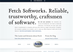
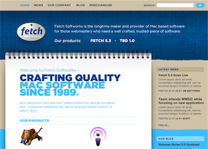
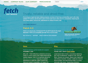
Happy Cog’s artists gave us three very different design concepts to consider. The first was clean and classic, with an emphasis on typography. The second evoked craftmanship, and reminded me of my reason for naming the company “Fetch Softworks“ rather than “Fetch Software“: I liked the image of a workshop with artisans carefully crafting things. The third had a visual originality that spoke to our outdoorsy location in rural New Hampshire.
We found things to like in all three approaches, but settled on the first as best representing who we are. We were tempted by the third. It reminded me a bit of the Delicious Monster site in having a very pronounced, and unique, aesthetic. But as much as I appreciate visual creativity, the reality is that our strengths lie elsewhere. It was an attractive shoe that didn’t fit.
Pick, Pick, Pick

The Happy Cog crew proceeded to turn diagrams and images into XHTML and CSS. We had to decide exactly what we wanted. What browsers did we care about? Did we care enough about using interesting fonts to use sIFR?
With each delivery of new pages from Happy Cog we found nits to pick: should these links have dotted underlines? Should the button’s hover state be lighter or darker? Shouldn’t the text in that image line up with the list items below? We’re lucky they never added us to their spam filter’s ban list. But having put up with a crummy site for so long, we were reluctant to sign off on anything that didn’t strike us as just right.
When we ran out of nits to pick, we had in our hands the XHTML, CSS and Photoshop files that were to form the design DNA of our new website. It was up to us to turn that code into a living, breathing creature.
Website design prototypes are Copyright © 2008 Happy Cog.


Wouldn’t CSS’ @font-face property be a simpler option then sIFR? This way there is no dependence on a) flash plug-in being installed, b) java script being enabled.
Hi Chris,
The advantage of sIFR is that it lets us use fonts that are not installed on the viewer’s system.
So does the CSS @font-face property. There are some good primers on it here [hacks.mozilla.org], here [craigmod.com], and here [alistapart.com]. This property has been supported by Safari since at least 3.1, Firefox 3.5, and IE 4 or 5.
The basic nutshell view is that it treats fonts similarly to images, and other linked resources on a web page, and they are downloaded in the background automatically when needed.
@font-face would also let us use fonts that are not installed on the user’s system, but my understanding is that there are unresolved issues with commercial fonts and @font-face. (Specifically, use of @font-face would require us to put the font up on the web server in a format that lets everyone download it, and such redistribution generally isn’t allowed by commercial font licenses.)